

Relevant: interesting/new
Integrity: accuracy/ethical
Function: ease of use, incites new understanding &/or is informative - tells a story visually
Form: beauty, structure, aesthetic appeal
Story: your message
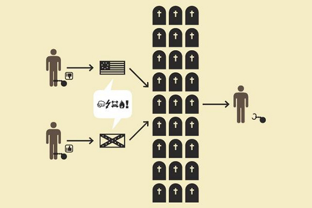
Source: Life in five seconds by H-57
What does it mean to be visually literate?
“The ability to decode, comprehend, and analyze images in order to construct meaning. Just as readers of text draw inferences and construct meaning from written representations of language, viewers of images also draw inferences and construct meaning from visual representations of information, though often less consciously so” (Burns, 2006).

Design is subjective in nature and not everyone agrees on what makes good design… Check out this article on good infographics design and this rebuttal to it (and the smoking hot comment sections of both!) But here are a few basics that most designers agree on:
Visual Elements/Iconography - Capitalize on previous knowledge (e.g. Stick figures represent people; octagon means stop; gravestones for losses during war; water symbolizing flood of big data; size can also add levels of meaning). Create balance using matching icons (same color/shape/backgrounds). "Picturize" charts and tables (e.g. pie chart as an eye or bar chart as sinking ships).


Typography - Use dark on light backgrounds and light on dark backgrounds, limit to 2-3 typefaces to create a hierarchy or create contrast (e.g. ![]() ), bold strategically, use size/weight to denote importance (e.g. Census Descriptions or Snake Oil). Sans serif fonts are recommended for the web.
), bold strategically, use size/weight to denote importance (e.g. Census Descriptions or Snake Oil). Sans serif fonts are recommended for the web.
Negative space - Use negative space rather than boarders or boxes to separate things (or consider softening borders of boxes with shadowing or fading). Avoid clutter-less is more (more info and examples).
Color - Select colors that are harmonious (color wheels can be helpful in selecting color schemes). Don’t forget to consider color blindness when selecting color (vischeck.com allows you to check an image or web address (your piktochart link) to see how your it would look to someone who is color blind. Color can be used to project cultural and/or emotional meaning (e.g. compare World vs U.S.) or to create contrast (e.g.  ). Rule of thumb: Limit color pallette to 3.

Burns, M. (2006). A thousand words: Promoting teachers' visual literacy skills. MultiMedia & Internet@Schools, 13(1), 16-20.
Golombisky, K., & Hagen, R. (2010). White space is not your enemy: A beginner's guide to communicating visually through graphic, web & multimedia design. Amsterdam: Focal Press/Elsevier.
H-57. (2012). Life in five seconds. London: Quercus. (Check out his TED Talk on data vis too!)
Krum, R. Cool Infographics. Retrieved from http://www.coolinfographics.com
Lankow, J., Ritchie, J., & Crooks, R. (2012). Infographics: The power of visual storytelling. Hoboken, N.J: John Wiley & Sons, Inc.
McCandless, D. (2009). The visual miscellaneum: A colorful guide to the world's most consequential trivia. New York: Collins Design.
McCandless, D. (2014). Knowledge Is Beautiful: Impossible Ideas, Invisible Patterns, Hidden Connections--Visualized. Harper Design.
McCandless, D. Information is beautiful. Retrieved from http://www.informationisbeautiful.net
Thompson, Gloria M. "Bridging the gap: moving toward a blended learning environment." Marketing Management Assoc. (2003): 122.

